Unicorn Potluck Branding
Client Project
My Role
Graphic Designer, Illustrator
Problem:
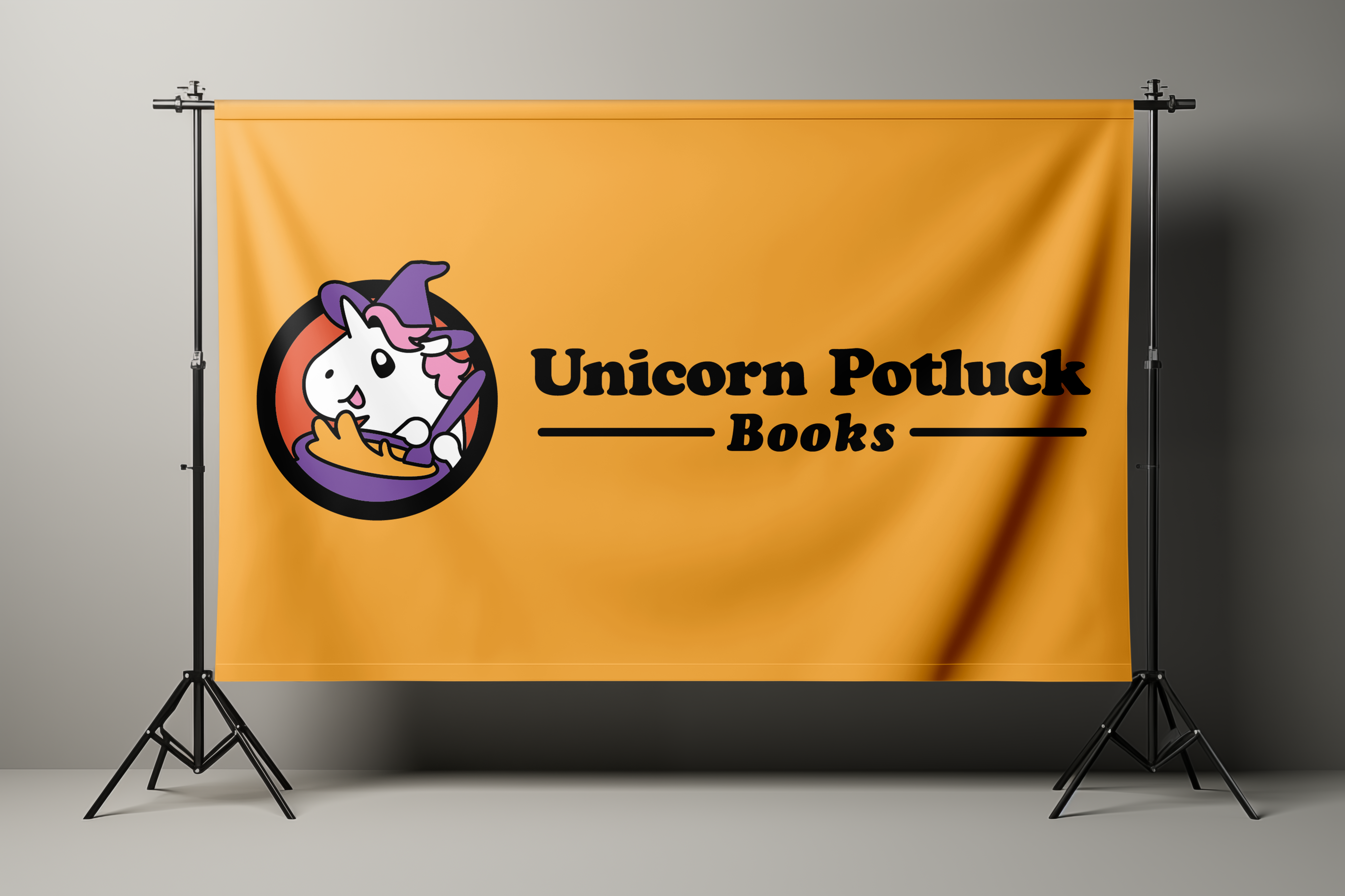
Unicorn Potluck is a writers' collective based in Southern Ontario, focused on LGBTQ+ fantasy and science fiction. They primarily produce comics and fiction for middle grade (ages 10-13) and young adult (ages 14-18) readers, as well as general fiction for adults. Their work is sold online and at festivals and conventions across Ontario.
The collective needed a brand that would feel at home in convention settings while remaining approachable for children and their parents—without losing its appeal for older audiences.
Solution:
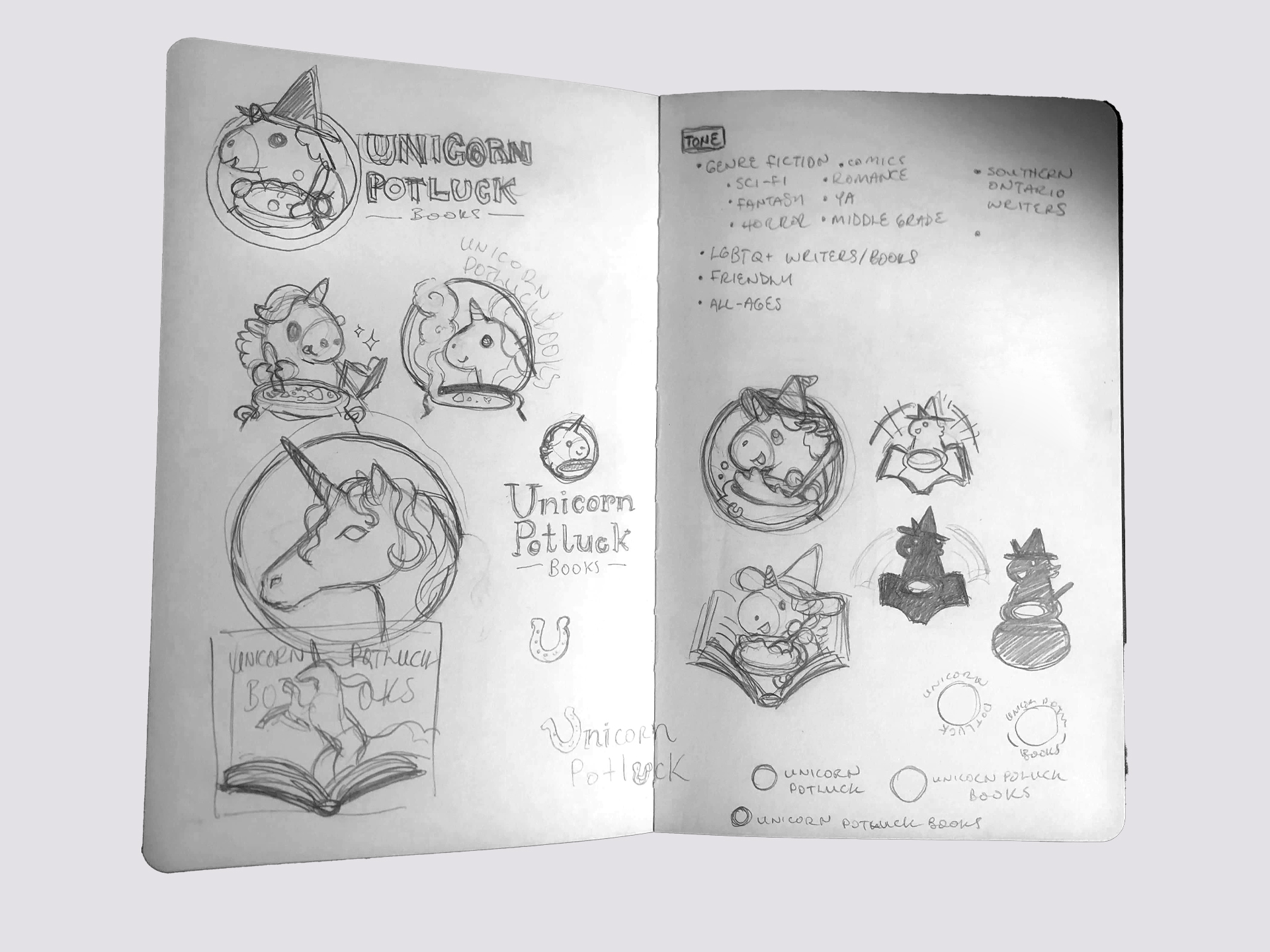
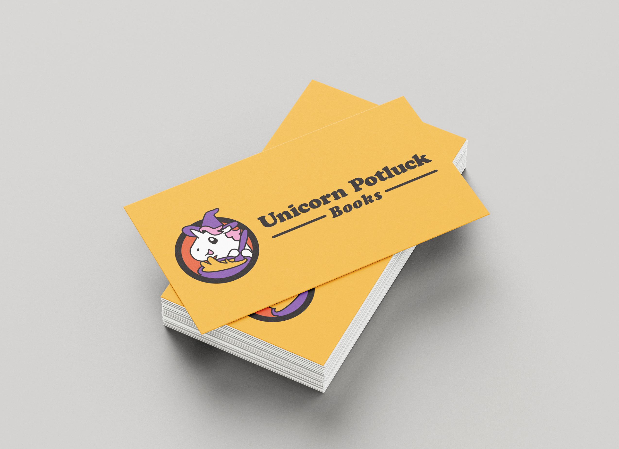
Naming the collective was a collaborative process. The core concept was consistent throughout: a gathering of fantasy writers, each bringing something different to the table. Early ideas included Gryphon Pie, Dragon Soup, Wyvern Stew, and Dragon Brunch, before we landed on Unicorn Potluck.
“Unicorn” nods to the fantasy genre and to LGBTQ+ identity. “Potluck” captures the spirit of the collective itself: every writer is unique, often working in very different corners of the genre, but together they bring a diverse, lovingly made spread to share.
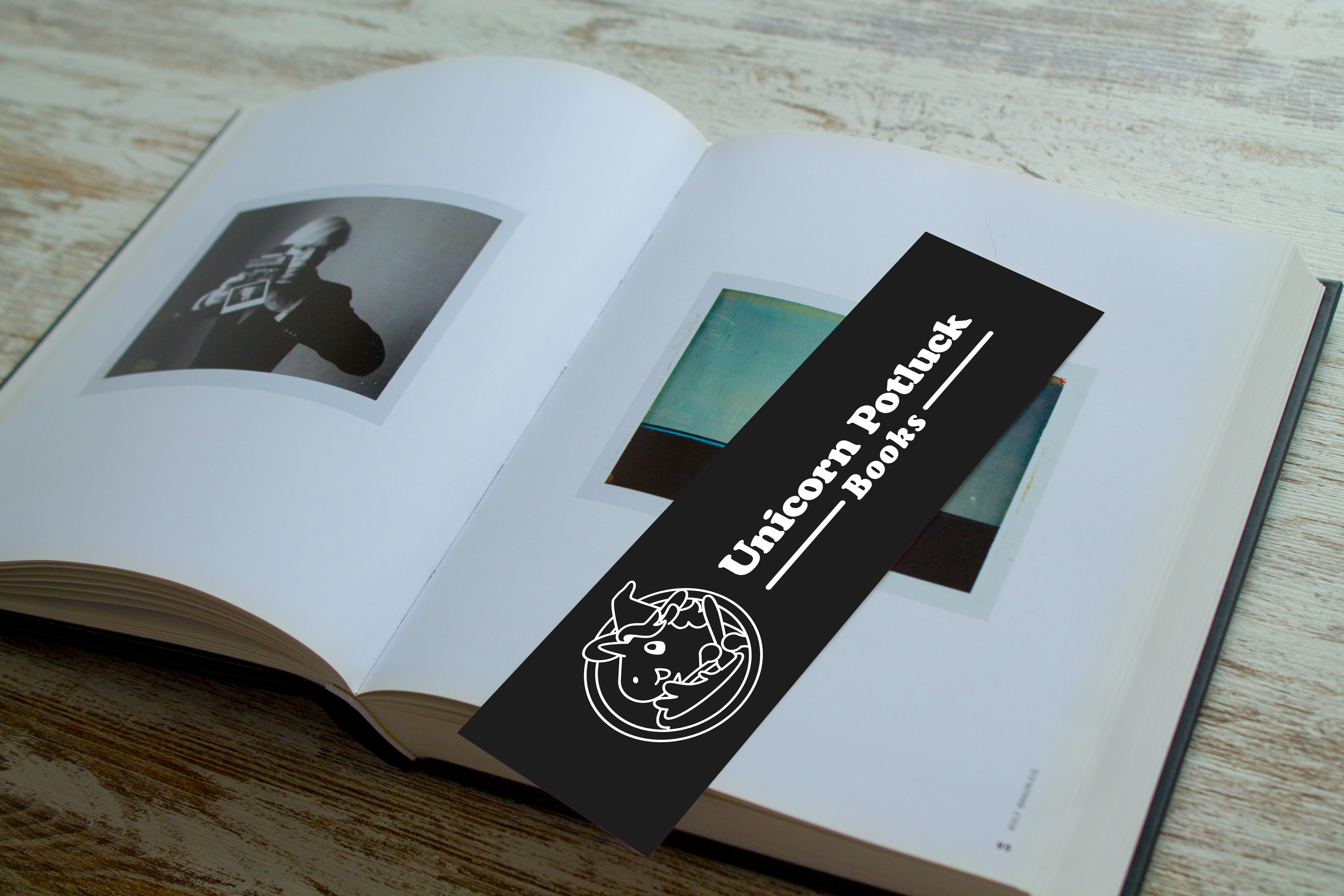
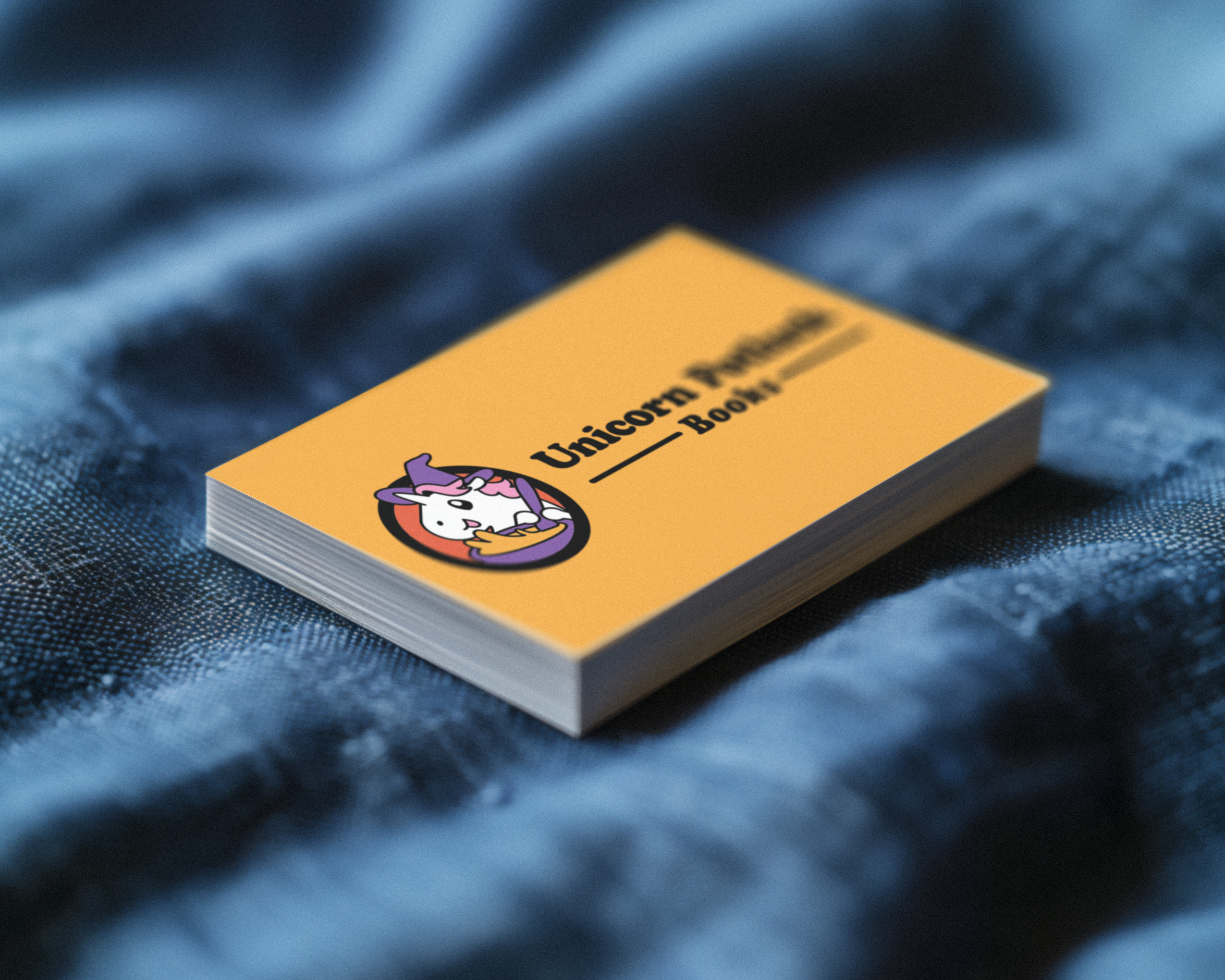
For the logo, I settled on a simplified, cartoonish character. The illustration is detailed enough to be expressive, but scales down cleanly and stays immediately recognizable. The cartoony style signals that the brand is all-ages and welcoming to younger readers. Additionally, it holds up well in convention environments where anime- and comic-inspired aesthetics are the norm.
The colour palette is bright and warm, creating an inviting, accessible feel. While a rainbow was tempting given the brand's queer identity, the visual weight of that many colours would have overwhelmed the rest of the design. The unicorn itself carries that meaning without needing to lean into it further.
Typography and colours were chosen to feel retro and nostalgic, with an eye toward appealing to parents of young readers as well as millennial and older convention-goers.